
Introduction
As Head of Development at WeAreKido, I work with product designers a lot. Our design tool of choice is mostly Figma and I’ve seen the mistakes designers still do, no matter how senior they are.
When I say “mistakes”, I mean pain points that slow down either the development process or the handoff process, which is the process of transferring the project from the design phase into the development phase.
No matter how good or precise your handoff process is, some pain points will only reveal themselves when the development phase begins, as such it can not only slow down the process but make the development process frustrating for the developers.
This frustration can end up as a rift between the design team and the development team, each stuck in its own corner instead of having a team that works well together with some that design and some that write code.
I’ve grouped these mistakes into 2 sections, some are harder to explain and implement inside the design team and some are easy, I’ll start from the harder stuff because I think they are more important to fix if they arise in your organization.
Mistakes that only developers can see
Mistake 1: Making desktop/ mobile designs that use different semantic tags
This one can drive a developer crazy, what I mean by “different semantic tags” is that sometimes a designer will decide that a title for the page in desktop mode should be “h1” which could be also the name of the style in Figma as well as the semantic tag the developer will use in HTML.
The problem begins when the designer decides that it looks too big on mobile, and instead of changing how “h1” will look on mobile in the entire system — the designer will just change the style of that one element in Figma into “h2”.
Figma lets you do that without any problems, HTML does not. An element using the tag of “h1” will always use the tag of “h1”, no matter the screen or the device you’re viewing it on.
There are solutions like making this element an “h1” with a class of “alternate” for example and then faking it all in CSS, but this is a solution for a non-existing problem that the designer manufactured, it breaks the system first approach and it slows down the development process for no good reason.
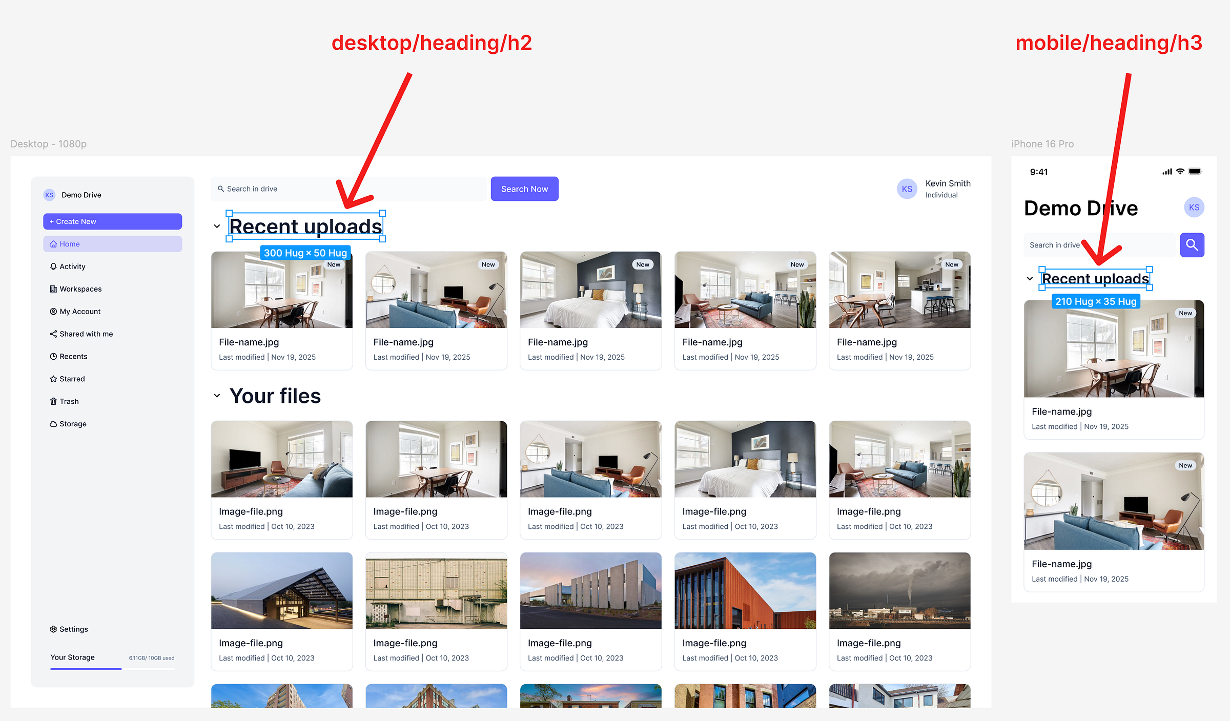
HTML h2 will not magically become h3 on mobile
Mistake 2: Only designing the happy path
This isn’t really a “mistake”, it’s more of an oversight. The designer might hand over screens with a lot of content and images but will not design what happens when the content changes, when it’s missing or when something goes wrong.
A placeholder for missing images, when does the content cuts-off if there’re too many words, what happens if there is no content, if the content is slow to load, if images are too small or too big or transparent or are GIF animations.
There’s so much that can go wrong and we, as developers, see all these different situations that can break the design, we can and should always ask questions but it would be even better if the designer would think of these in advance.
image #3 is missing — that happens a lot in the development phase
Mistake 3: Padding and fixed height are not the same
This is an easy one to fix, let’s say I’m developing a button component and I take the same font in the same size from Figma for the label, then I use the same paddings as the designer used in the auto layout — than my button should be the same height.
If the button is off by a pixel or two, let’s say my button in development is 51px in height and in Figma it’s 52px. That usually means the designer used a specific fixed height instead of leaving the height to “hug” in Figma, which translates to “auto” in CSS.
At this point why did we even use the paddings and not just centered the text using the auto-layout in Figma, or “flex” in CSS? Also this approach in Figma will totally break the button if the text will break into 2 lines, which shouldn’t happen but that was the point of “Mistake 2” (see above).
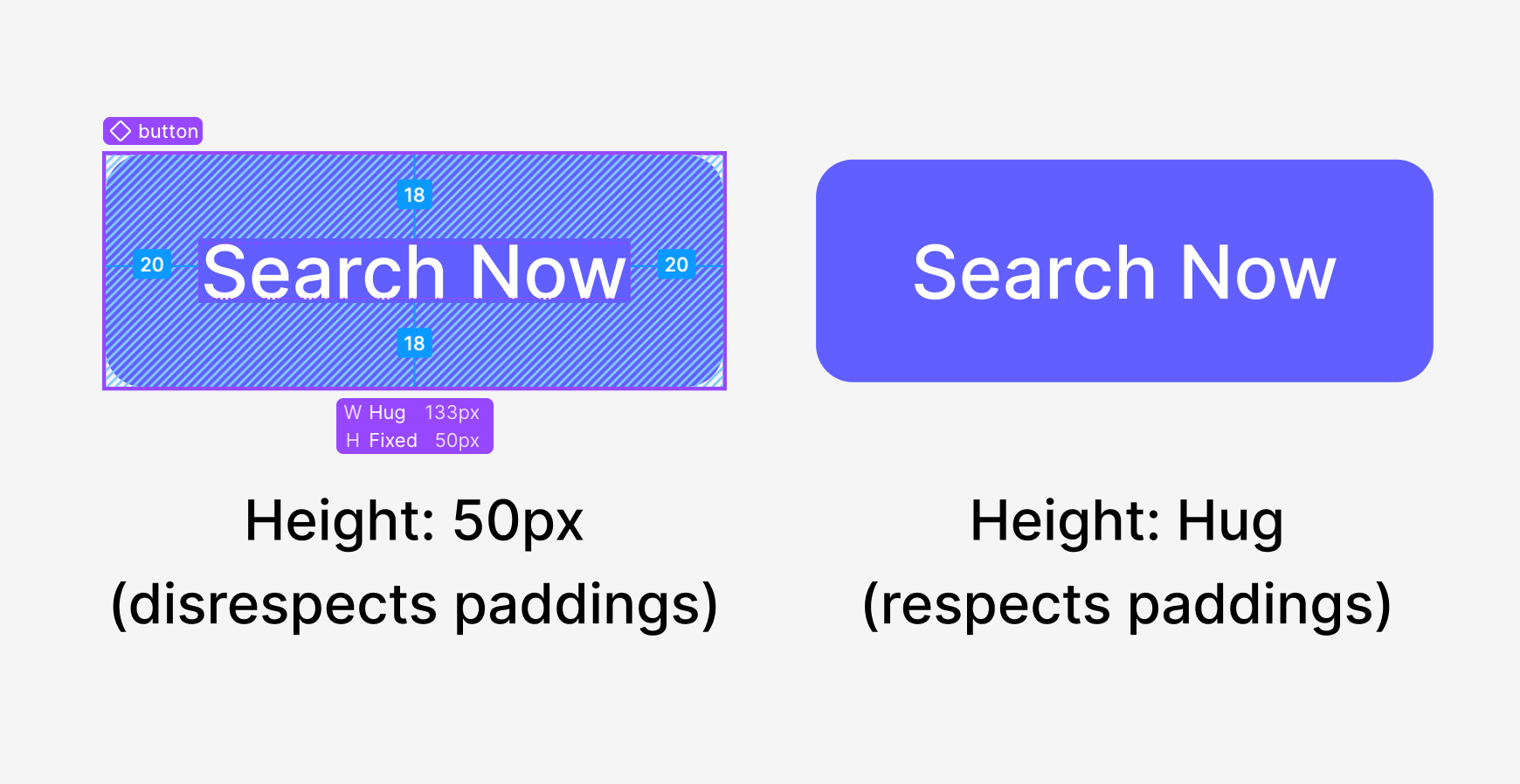
Why do we even need padding at this point?
Mistake 4: Detached or unique components
This is the worst mistake of all — when working with a Design System in Figma nothing should arrive to the development phase as not a part of the Design System.
Nothing should be detached and nothing should be “unique”, even something that is so “unique” that it only appear in one place should be a part of the Design System and it should be a component, not made out of frames or groups.
In development everything is a part of the larger system, in big projects making a component outside the Design System could be very destructive, it could also be ignored by the development team by accident.
Worse than that — it could be built in development with inline styles and without considering the system first approach, which can make components appear non-consistent, can lead to duplication of efforts and can accumulate to a future tech debt.
Smaller Mistakes
These are mistakes that can be rectified easily by just telling the designers not to do those things, they are not mistakes that are smaller in their severity, only in their potential solution.
Mistake 5: No constraints
Constraints in Figma lets the development team see how this layout can work for slightly different screen sizes, see in the example below how much more information the “right” use case can gives us over the “wrong” use case.
We can see the cards should stack next to each other in a “flex-wrap” CSS property, also we see what sticks to the right and what sticks to the left, what stretches the entire screen, like the search bar, and what increases its gap, like between the title and the avatar.
Not using this properly can lead to confusion from the developers and will end up with elements that are not built as efficiently as they could have been.
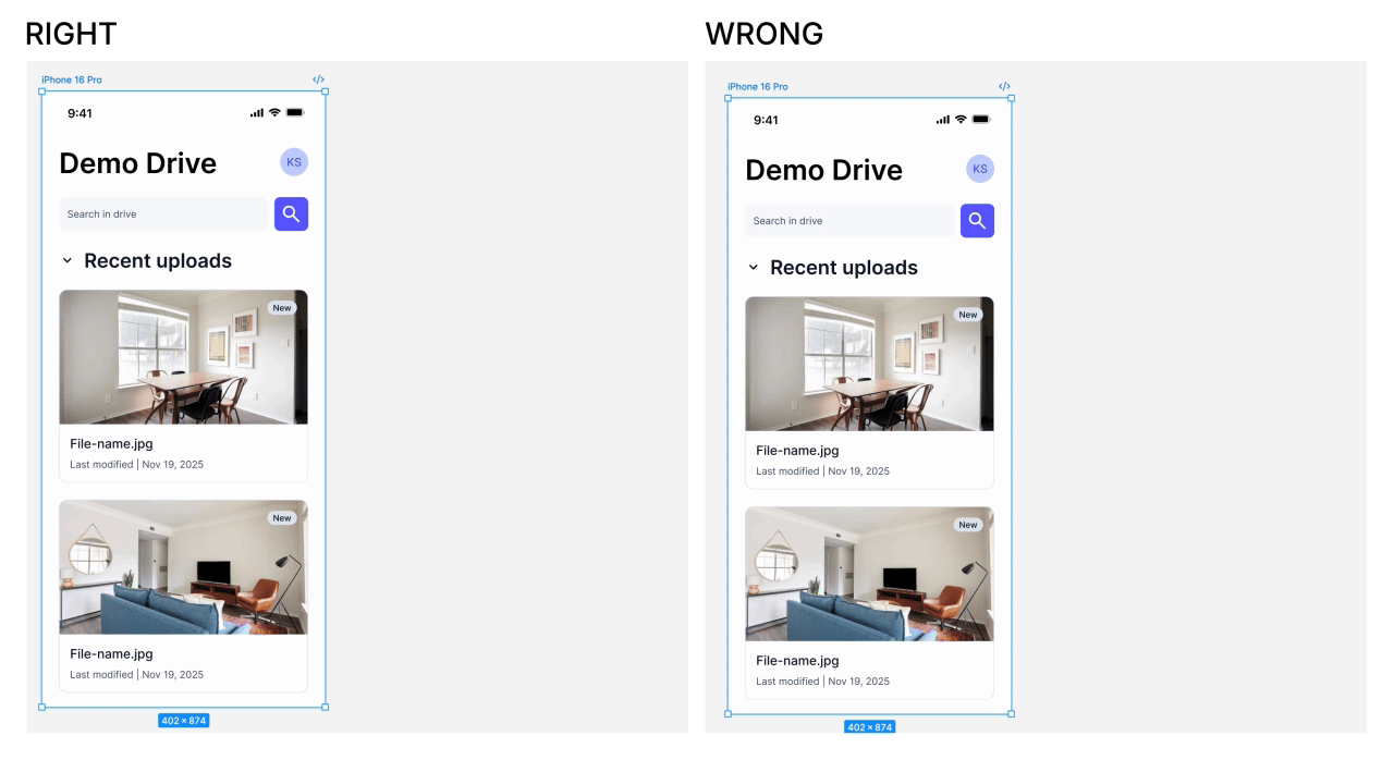
Amazing how much a developer can learn from the right constraints
Mistake 6: No hover, active or focus states
This is self explanatory: buttons, checkboxes, input fields etc needs to have their different states designed carefully, the different states meaning hover state, active state (pressed), focus state and sometimes even more states like disabled, like placeholder state, like empty state etc.
Mistake 7: Not thinking about Motion
It’s not really a “mistake” if the designer doesn’t expect any motion, but more often the designer had something in mind regarding how the states transition between one another or how the layout shifts but it somehow stayed in the designer’s head.
Anything regarding motion needs at least one of the following things:
A reference to a different website or a CodePen that used the same effect or transition.
A prototype of how it should work, can be done in Figma, After Effects, Rive or any other tool.
A detailed explanation of the transition, both going in and going out (unless it’s symmetrical).
Mistake 8: Not whole pixels
Again, this could be a product of scaling or of a designer not paying attention, but in CSS we’ll always prefer whole pixels, like 50px instead of 50.78px (see example below).
The reason that developers will prefer whole pixels is that different screens will behave differently, we are all used to Retina screens and the pixel doubling we get on higher density displays, but not all screens will display it properly.
For example, let’s take a stroke (or border) that is 0.5px in width, a screen without any pixel doubling might not even render it, it might round it down to 0px, instead of just using 1px which will not be rounded at all and will always be rendered as 1px, no matter the screen or the display resolution.

What happened here? Did the designer scale it?
Closing Words
All of these mistakes are mistakes I’ve seen in the wild, they come out of designers that don’t know enough about the development process. I highly recommend to any designer that designs for the web to learn the basics of HTML and CSS.
If you’re a designer for mobile apps then learn basic Swift, if you work in gaming — learn Unity etc. We work mostly for the web so my recommendation will be HTML & CSS, there’s very good introduction videos in the Bootcamp of Frontend Masters.
I implore every designer to watch at least “Introduction to HTML” and “Introduction to CSS” as they can explain a lot and make you, as a designer, more aware of any possible issues with your designs.
If you liked this article, please follow me for more, and of course clapping is always appreciated. If these mistakes is something you see in your organization, feel free to share this article with any designer or developer who might get value out of it.
Thanks for reading. 🙏